

In the modern enterprise landscape, the software you select isn't just a tool—it's a digital workspace that dictates the pace, energy, and productivity of your entire team. With the average US business now juggling dozens of SaaS subscriptions, the cost of a "wrong choice" has shifted from a simple financial loss to a significant drain on employee morale and operational efficiency. The challenge isn't finding software that can do the task; it's identifying the software that makes the task effortless. This guide is designed to empower you with the professional framework needed to identify truly user-centric SaaS products before you commit your budget and your team's time. Research from the Nielsen Norman Group indicates that usability is not just a binary state—it is a measurable metric of how quickly a user can master an interface.
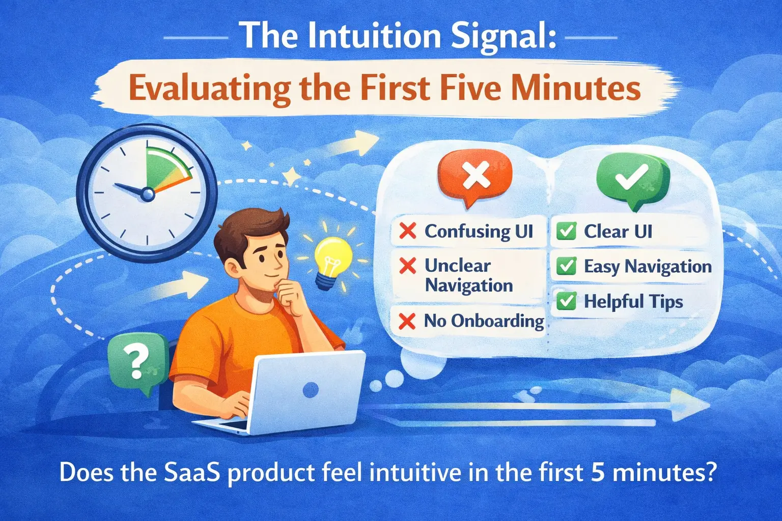
1. The Intuition Signal: Evaluating the First Five Minutes
The most critical identification signal happens within the first five minutes of interaction. True core usability isn't something you should have to "learn" through a 50-page PDF; it should be rooted in intuitive architecture that aligns with your team's existing mental models. When you log into a product like Notion or Linear for the first time, you don't find yourself hunting for the "Save" button or wondering where the main menu is. The interface anticipates your next move, using familiar iconography and logical spatial grouping that makes the software feel like an extension of your own thought process.
To identify this signal, pay attention to your immediate cognitive reaction. Are you pausing to think about how to use the tool, or are you immediately thinking about the workitself? User-friendly SaaS products disappear into the background. If you find yourself confused by the navigation heirarchy or frustrated by "hidden" menus in the first session, it is a clear indicator of a design debt that will plague your team for months. Identifying usability starts with trusting that "gut feeling" of digital fluency.
The Identification Signal
"If you have to explain the interface to a teammate, the interface has already failed. Look for 'discoverability'—the design's ability to teach users how to use it through visual cues alone."
2. The Onboarding Story: A Proxy for Long-Term Success
A product's onboarding sequence is a direct proxy for how much the developers value your time. The best SaaS products replace heavy-handed tutorials with progressive disclosure. This technique involves showing users only the features they need at their current stage of the journey, preventing the "blank canvas paralysis" that kills adoption. Platforms like Slack master this by using interactive walkthroughs that enable participation immediately.
When identifying a user-friendly tool, look for a "Time to First Value" (TTFV) that is measured in minutes, not hours. If the setup requires multiple sync meetings with a sales engineer or a lengthy configuration phase just to see a basic dashboard, it is likely a "high-friction" product. Truly user-centric companies invest heavily in the self-service experience, confident that their product is intuitive enough to be mastered without a chaperone. This autonomy builds immediate confidence in your team and lowers the barrier to total organizational adoption.
3. Information Density and the 'Cognitive Load' Test
There is a fine line between a "powerful" tool and a "cluttered" one. To identify a user-friendly SaaS product, you must evaluate its approach to information density. High-quality design uses whitespace not just as an aesthetic choice, but as a functional tool to reduce cognitive load. When you look at a complex CRM like HubSpot, notice how the interface uses distinct boundaries, variations in typography, and clear call-to-action buttons to guide your eyes. You are never overwhelmed by data because the most important information is always given visual priority.
Contrast this with "user-hostile" software that tries to show every data point at once. This leads to decision fatigue and an increase in human error. As you evaluate, ask yourself: Does the software help me focus, or does it demand my attention in a dozen different directions? User-friendly products provide powerful filtering and customization options, allowing users to prune the noise and only see the metrics that matter to their specific role. This adaptability ensures the tool remains relevant as your business scales and your workflows evolve in complexity.
The 'Clean Screen' Checklist
Check for responsive performance: A product that feels laggy or takes more than 2 seconds to load a new page will eventually become a source of daily frustration. Performance is a feature, and in SaaS, speed equals usability.
4. The 'Safety Net' Factor: Errors and Support
A product's true character is revealed when something goes wrong. Identification of a premium SaaS includes looking at how it handles the "human" element of mistakes. User-friendly software incorporates graceful failure systems. This means that instead of showing a cryptic red error code, the platform explains what happened and how to fix it in plain English. Features like multi-step "Undo," auto-save, and version history provide a psychological safety net that allows your team to experiment and work boldly without the fear of breaking something.
Furthermore, evaluate the "Helper Economy" surrounding the product. Is there a robust, searchable knowledge base? Are the tooltips context-aware, appearing only when you might actually need them? Premium products like Zoom or Zendesk treat their support documentation as part of the core product experience, not an after-thought. When you can find an answer in thirty seconds through a well-organized help center, you feel more confident and in control of your digital environment. This autonomy is the ultimate form of customer respect.
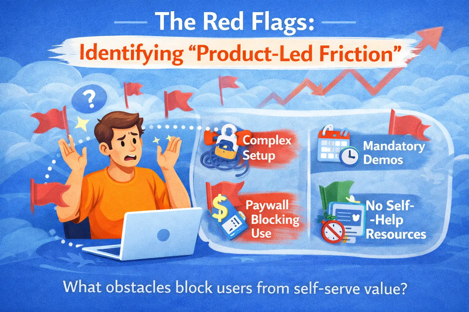
5. The Red Flags: Identifying 'Product-Led Friction'
Identifying what a product is not is just as important as identifying what it is. Be wary of software that hides basic functionality behind complex pricing tiers or requires constant "upsell" interruptions during the workflow. This "product-led friction" is a major red flag; it suggests that the company is more focused on its own revenue growth than on your team's success.
Other warning signs include an over-reliance on legacy technology (e.g., forcing you to use a specific outdated browser), a lack of clear data-export capabilities, or a mobile experience that is just a clunky "wrapper" for the desktop site. If a product doesn't respect modern web standards, it likely won't respect your modern workflows either. True user-friendly SaaS is portable, transparent, and unrestrictive, giving you the confidence that you are a partner, not a hostage, to the technology.
Conclusion: Embracing Digital Confidence
Ultimately, the process of identifying user-friendly SaaS is about reclaiming your focus. By looking for the signals of intuitive design, immediate value, and human-centric performance, you are ensuring that your technology investment results in a happier, more cohesive team. The right software doesn't just solve a problem; it empowers your people to be the best version of themselves.
At Devian, we specialize in bridging the gap between complex business needs and world-class UI/UX design. If you're looking to audit your current tech stack or select a new platform that will truly resonate with your team, our experts are ready to guide you. You can browse more of our product strategy insights to stay ahead in the 2026 digital landscape. Together, we can build a digital environment that fosters innovation, speed, and unwavering confidence.
Reader Thoughts
0 comments — join the conversation
Be the First
No thoughts shared yet. Start the conversation with your unique insight.